With dynamic labels now in Desmos, a new world of possibilities is opened up for interacting with graphs and diagrams. This post is my attempt to highlight five uses where I see dynamic labels enhancing a graphing screen.
The basic idea is that in your point labels you can now include variables, and the label will dynamically update as the variable changes. It is helpful to note that if you hide a point you can still show a label, so this allows you to get text anywhere on the screen.
 |
| Making a dynamic label in Desmos |
In each of the examples listed below, I've shown how it applies to a basic graphing screen, but they work even better as screens within larger Desmos activities.
1. Maximum area for a fixed perimeter
This classic problem can now be explored completely from a graphing screen.For example, below is an example of how it might look if only three sides of fencing area required, and the maximum area is sought. Spoiler alert: the maximum area is not generated by a square.
Link to the graph is here.
 |
| Finding the maximum area with three sides of fencing |
2. Unit Circle
The unit circle in Desmos was always good but now you can have the angle displaying on the arc, so students don't need to look over to the expression list to see its size.
Link to the graph is here.
 |
| Exploring angles in a unit circle |
3. Exploring gradient
Having the gradient of a line appear directly on the line is useful both when exploring gradient in terms of rise and run, and also when looking at gradients of tangents.
Link to the basic gradient construction is here and link to the graph with a movable tangent is here.
 |
| Exploring gradient |
 |
| A graph's tangents are shown together with their gradients |
4. Normal distributions
Really any continuous random variable, or indeed any integration visualisation, is improved by having the area appear on the graph itself.
Although it's not an interesting problem for normal distributions, finding the median by dragging a point feels much more intuitive when the area is displayed on the graph.
Link to the graph is here.
 |
| A normal distribution shown with probabilities |
5. Distances between points
This one is probably most useful in a Desmos classroom activity when you can have a graph overlay to generate a locus, but when exploring distances between points it is nice to be have the distance appear on the graph.Also note you can label a point like A({p},{q}) to see the point name and its coordinates.
Link to the graph is here.
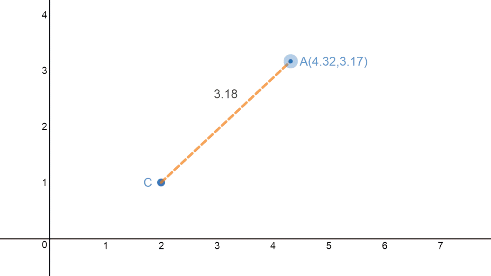 |
| The point A can be moved and the distance from C is updated dynamically |
These represent a selection of applications I have either encountered or thought of in the past week since dynamic labels were added.
I look forward to seeing other examples either on Twitter or in the comments section. Although preferably Twitter because I don't check my blog often enough to see the comments.